Wednesday, April 6, 2011

Finalizing the last touches

AHH - - its almost the launch date and everything is done !! i did a quick QA before anything and i also fixed and tweaked the issues that were happening when users click on certain navigation! menu alignment, logo link, and other tasks for tweaking but here is a QA of the last couple of steps before the release date.

Quality Assurance

Home Page

Logo
when entering the home page there were a couple issues that weren’t corresponding to the coding. The vans logo wasn’t linking to the index and random black boxes would appear after the user clicked on the navigation.  

Navigation
The Navigation seemed a little off centered from the top and spaced out. It needed to be corrected and aligned properly.  The navigation was also going through the same issues as the Logo button. There would be random black boxes that would appear after the user would click on.  The black boxes would also interfere in the design layout and also cover the navigation buttons. This was fixed by linking the button file instead of the “blank” image that was being reference for users to be able to access the pages.

the clothing navigation is simple and sleek, the only thing that was bothering me was the visibility of the sub-navigational buttons [men’s, women, children]. The font floor was black with white outline and the background of the sub-navigation was black so this made it difficult to see. The functionality of this sub-navigation works and rolls down smoothly. Inverting the color of the buttons for the sub-navigation made it much easier to read and a better understanding on what the selections in the clothing sections are.

Media Page and About Page
The media page had to be tweaked with all the corrections made in the index page for the functionality and visibility of the buttons in the navigation bar to work. Doing this change made the black box disappear.

CSS
There were minor errors in the CSS coding file that had to be corrected. Things that were changed and fixed were the sizes of the buttons, the alignment to correct the navigation, changing the background, adjusting the coding in the sub-navigation. There were minor pixels tweaks but everything now works great
Videos
The video all work properly and are linked correctly.

Banners
All the Banners work and are linked correctly.


Posted by Karen H

the shop page


Getting ready for the finishing touches! the shop page is now up!! all the back drop patterns are in place, thumb nails fit and original size image works perfectly! - everything seems to be looking okay.

Check soon for full website release!

Posted by: Karen H
Navigation Set and Loaded


With the coding on its way to perfection the navigation buttons were finalized by marcos designs. The combination looks great on the website. It is easy to read and understand and it also navigation perfectly. Although the time was running short we stuck with 3 main navigational buttons; clothing, media, and about and the logo linking it back to our home page. Here is a screen shot of the final navigation.


Posted by : Karen H

Media - banners, videos, animation

Light camera action! - well not literally but with a bit of animation - images can be transformed from stills to great eye appealing visual designs. Using flash adobe cs5 marco and neil created flash banners and animations that work and fix well into the website. staying with the big picture concept and make the images shine through. The animation is the vans logo that i created which was made into a left and right animation and transforming colours.here are some screen shots of these animations as a preview.


Posted by : Karen H

Back Drop for the Shop section


In the shop section there is a green box that brightened the screen - well that is gone out of the way and has now been replaced with some interesting pattern designs - also made by marco. which makes the designs more balanced. here are some of the designs previews. (these are 3 designs stuck into one images)

Posted by : Karen H

CSS Coding


Neil and marco had been meeting up prior to the launch date and have mastered and created the -almost ready final version of the website. another sneak peak at the website!

Posted by : Karen H

Navigation Buttons!!


The navigation buttons were hard to make. From picking the right colour, to the right size, the right font, eligibility, do the buttons fit the theme, does it flow. there is so many thing to consider when creating these things. Marco made these buttons that looks sleek and clean cut. check out his designs.

posted by : Karen H

Gather data.

Gathering some information - content for the news page. I provided 4 pages of information that can be imputed into the website - News and Events of upcoming vans stuff!! here is a preview of what we got.

----------------------------------------------------------------------------------------------------

Vans Pier Classic Webcast is Live!

The Vans Pier Classic presented by Jack's Surfboards is on in clean South Side Huntington Beach Pier. Watch the live webcast as some of the finest surfers in the world battle it out for valuable 4-star WQS tour points.

Everything You Want From SXSW Music Festival

Although most of us are still recovering from our latest adventure, SXSW Music Festival in Austin, Texas, we've posted tons of coverage from interviews to photos to some interesting stories. Take a look and start planning your trip to join us next year!

John Florence Rips on Transworld Surf Cover

The Transworld Surf Buyer's Guide of 2011 features the one and only, Vans team rider John Florence. With over a decade of shredding in waves from two to twenty feet, check out his Pro Spotlight in the mag. to find out which name he prefers, among other questions.
----------------------------------------------------------------------------------------------------------
Theres more to come!!

Posted by : karen H

Finalizing the background

After finalizing the final background and getting it approved - this is the final design.

created by marco

posted by KARen H _

Background Change


Here are some images that were made to create the background change. With the change of the whole theme for the website background also had to be a change for the new style that we were going for. Here are some previews of the background images. made by marco and neil.

Posted by : Karen h ___

Vans Shop~!

Groovy~ 
After scavenger hunting for some images for the vans shop i found loads of designs - during my week off of catching the flu i had been working home - gathering images, resizing and also making thumbnails dimensions for the upcoming shop design. Here are some of the images that were found as a preview to what you might see on the upcoming release of the website. [men's, women, girls, boys-clothing and shoes]

posted by karen h

Marcos AWesome images


After a long awaited recovery marco showed us the imaging photos he has found, edited, and finalized - they looked awesome! He found more then 20 + men van shoes and great shots of skaters shredding! these images were great and would look amazing to see work into the concept of the website. Although the theme seemed to be lacking [for me anways] we started to rethink of the theme , layout structure stayed almost similar to the wire frame. Making image back drops of the sugar skulls that neil had made weeks prior into the design concept added a different aspect of pattern which was great - balance. Marco also made some interesting Vans image back drops of the logo aswell(that process to be shown in later posts). check out the process .


Posted by: karen H

Wireframes

Here are some of the wire frames created and ready for Neil to code for the website. The layout used was layout number 2 in the mock up versions. and this was used as a rough template so that when we had our product, info and images we would be able to just simply update them with the correct information.


Posted by: __Karen H

Sugar Skull _ Illustrated files

After a meeting with the manager of our company we had been told that the client would like more vibrant colours, interesting design, and a more appealing less simplistic and more artistic sort of feel for the website. The layout designs that I created were 4 colours and content but with this new theme it seemed to have taken us in a new direction. Having to rethink the layout and also colour for the theme we had to think of what other assets to find. in the previous posts - neil had drawn some sugar skulls a while back - we all liked the funky design of it and the look. I then began to search for different styles of sugar skull called santa muerte - their bright, colorful and i thought it would work perfectly in our NEW theme. After renting out a tablet, finding photos and finalizing the selection - i started to Draw!! it started taking me more then i thought- after a couple hours later this creation came to play.. but i reallly dont like it. .  and i still dont. I just didn't think it fit with the theme of how it should look. check it out...also 2-3img is neils drawings in groovy colors..


Posted by __Karen H

Layout Mock ups

After our meeting - Karen designed some mock ups for the website and came up with 2 sweet designs. We all commented on things that could be improved and things that needed to be added. None the less great feedback from everyone and the development of the wire frames soon began.

The first layout was designed for just a simplistic layout. My favourite part of the first attempt layout was the film of images for the banner. It was a sort of design seen in many skateboard magazines that i thought would be great to implement into the design. Keeping with the skater, and visual appeal, I thought by creating a media home page would be appropriate [for example when you pass by west49 they are always playing clips of skateboard videos] I thought it would be a wicked idea to put a video and also a banner of a skater doing a trick. For the rest of the content space that was were the news would follow.

The Second layout that I made, I thought was impressive, I thought it fit the theme that we were all going for with what we had planned out in our meeting days prior. This layout seems to fit -- With the layout concept the idea was to capture the users eye directly to the visual concept. because the first layout seems to be a bit clustered for me i wanted more visual less info. So by creating a big banner image that can change by the user you are able to see different images. Also included near the bottom are thumbnails are other interesting skateboard photography and finally near the bottom are news content where you are able to read up to date new information that the vans website has to offer. The navigation is also sleek, clear and understandable to navigate.

posted by__Karen __

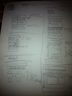
Sketch Design of our Van Website

During the beginning of this project we had thoughts and ideas of the design for the website. As we got together and brainstormed some ideas for our client - we finalized pages, mock ups, and  navigation.
Here are some of the sketches that we drew.


There was more where that came up, our ideas started to expand as the weeks went on. There will be more updates in just a minute.
-kare

Tuesday, April 5, 2011

Near launch date

Well where near the launch date for the totally revamped Vans site and where glad we can bring it to you.

If your now already please make sure to follow us on Twitter & Facebook:

Twitter: http://twitter.com/ F4Designs_Vans
Facebook: http://www.facebook.com/home.php?sk=group_204794419549845